From a non-performing website to a key lead generator
One day we got a call from a local accountant in Amsterdam. Whether we could help them acquire new clients for them through online marketing. As yet, online was not an important channel for them: nothing was being done with it, but there was a belief that online could become important. It was up to us to manage this from A to Z.
First test through Google Ads
The goal was to start generating more revenue as soon as possible. This came with a few challenges: the budget was very limited, and competition through Google was cutthroat with relatively high click rates. Therefore, we advised to first run a small test through local Google ads, namely showing ads when people in the vicinity of their office would search on keywords like ‘accountant’. And then analyze how that would perform. And those initial results were not good….
After displaying the ads for a while and bringing in clicks, literally zero requests came in… There had been quite a bit of preparation, but the ads didn’t seem to work at all. That was quite a disappointment for everyone. After a brief analysis, we quickly saw where the problem was: the keywords people were searching for were all relevant. But still no requests were coming in. Apparently, people were not finding what they were looking for on the website, and were moving on with their online search. We had to work together for a solution.
From a newly delivered website, to a totally redesigned landing page
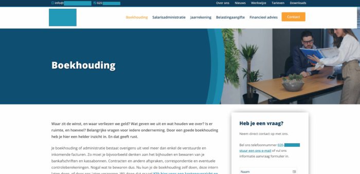
What was a bit annoying was that we just had a newly delivered website that the client was happy with (shown here). After which we then came up with recommendations to revamp it. In the end, our job is to get good online results for this client, then if it is necessary to do something to the website we will not fail to do so. Fortunately, the client understood this, and we could go about our business.
That ended up being a nice middle ground: we simply left the current website as it was, but created our own separate landing page that people would land on after clicking on an ad.

Many people thought this was a fine website in itself: it looks nice, the menu is clear, and there is a lot of information. We saw it differently. For example, from a user experience perspective, it lacks the following points:
- Texts are way too long. People don’t read pages, people scan pages. This causes almost all the information not to be read, and therefore people do not have a good view of this company.
- Don’t make me think. This principle says that users don’t want to think, and otherwise drop out. This page actually does make people think. After all, why should we engage this company? What are their strengths? That is not apparent at a glance.
- The clarity is missing. The title is “Accounting. But what does that say? Do they do accounting? And if so, for what kind of businesses? Or do they provide information about bookkeeping so you can do it yourself?
- Social proof is completely lacking. What do customers say about them? People want certainty and reliability.
- No sympathy is generated. People want to do business with companies they like. We don’t see any element that elicits our sympathy for this company.

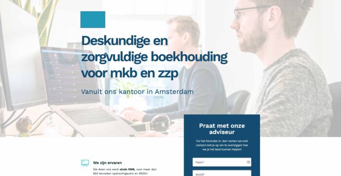
We went to work on these kinds of elements, trying to add all the best practices to the landing page. We would have liked to use some more personal photos of the company, but they were not available.
You can see the result on the right (up to the fold).
With this new page, we try to make it easy for the user: no distractions of a menu (indeed, the menu is gone altogether), clear and short text, and we show evidence that this company is experienced and let customers tell about them. We also try to paint a clear picture of what users can expect once they contact them.
Result
From 0 to 5% conversion rate
This new page immediately yielded tremendously good results: right from the start, users filled out the form, and the conversion rate became a neat 5.5%. Meanwhile, Google Ads is again a hugely valuable channel for this accountant, bringing in dozens of new leads every month, versus the 0 leads with the old (but still existing) page.
